🦠
🦎
❇️
🦠 🦎 ❇️
Media.Monks – APAC/Seoul Office Branding
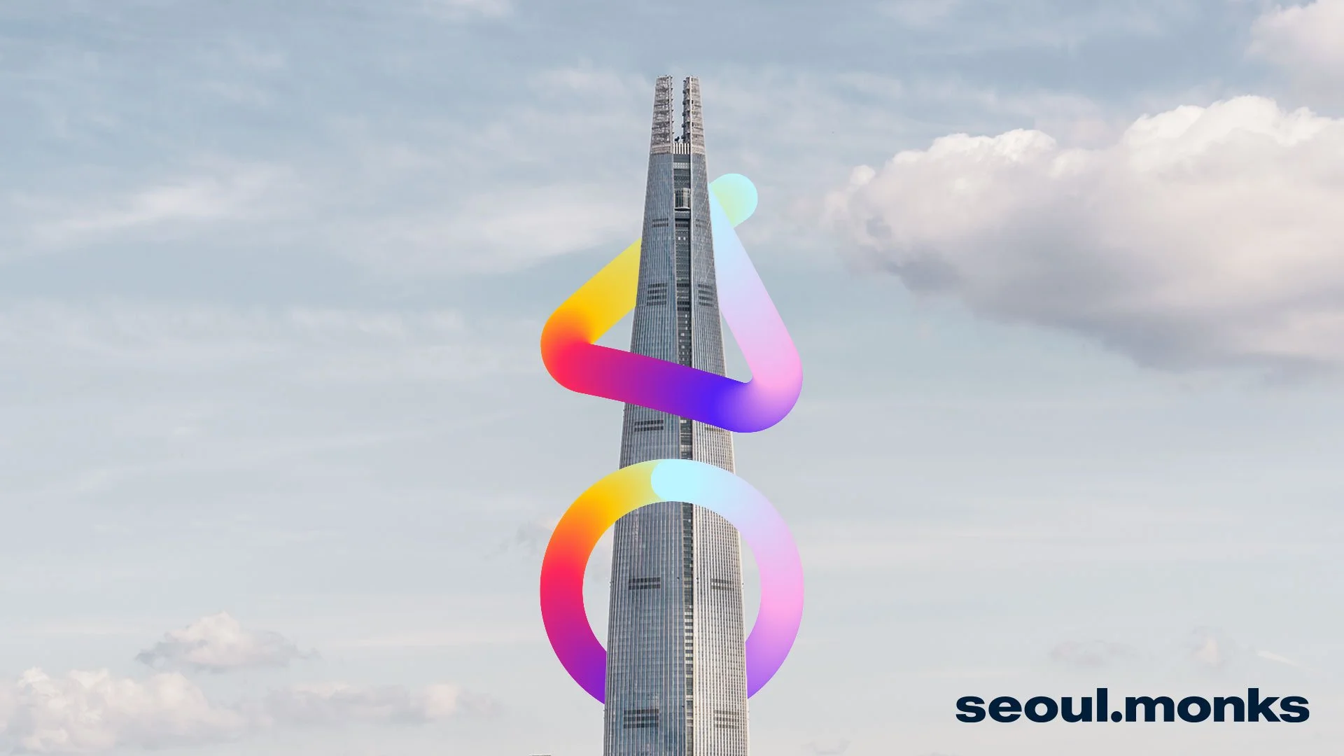
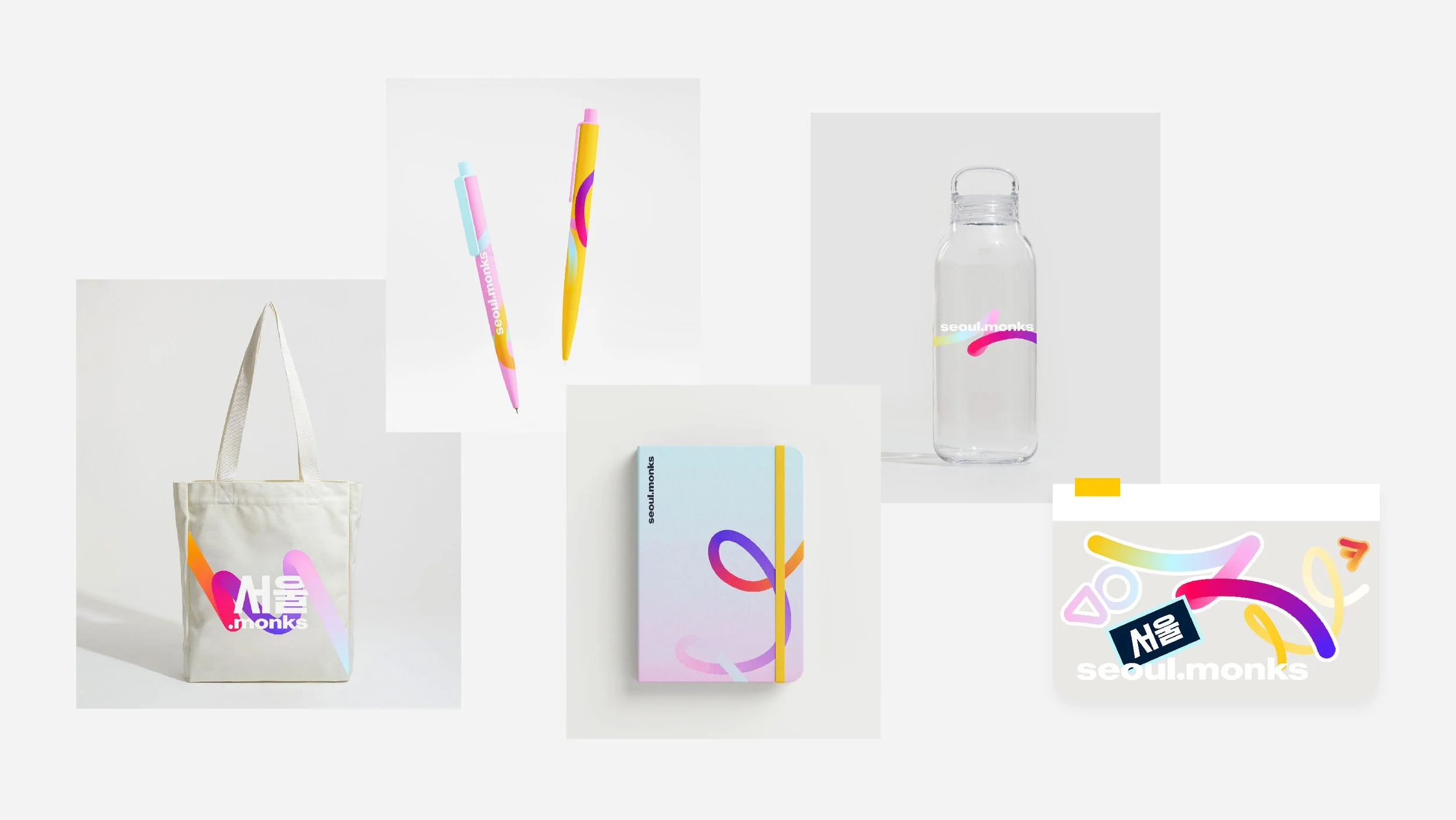
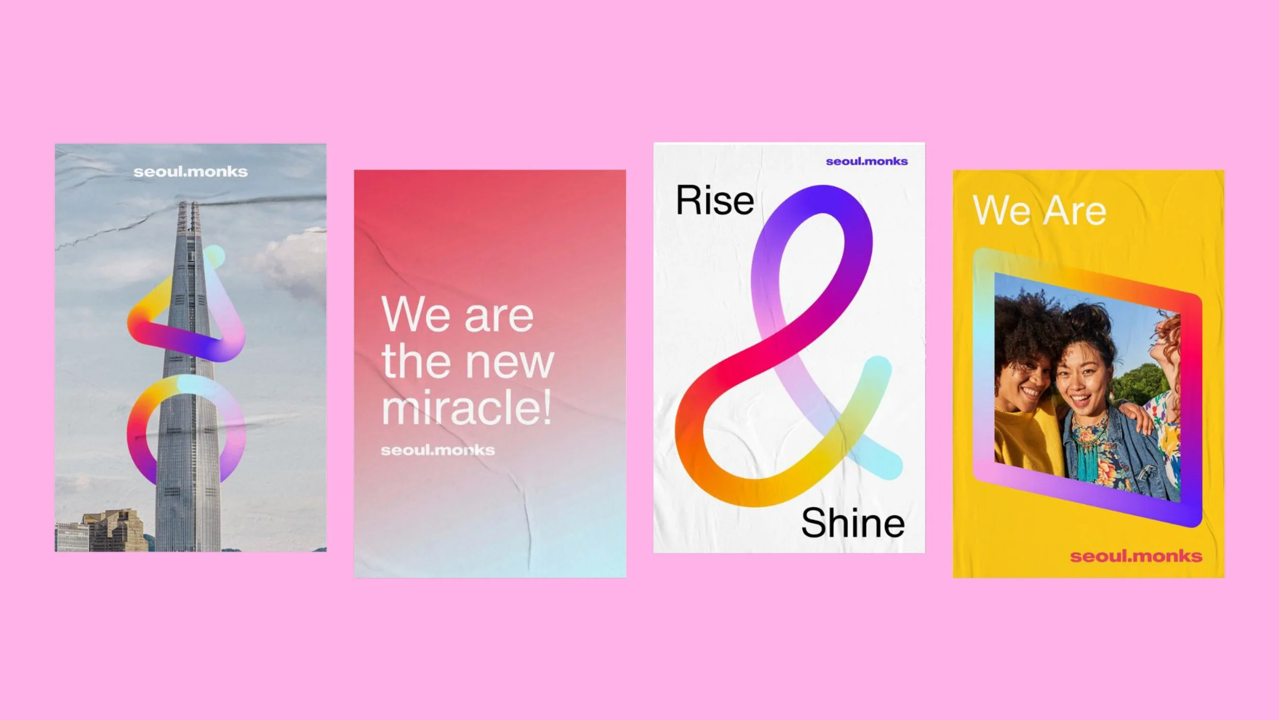
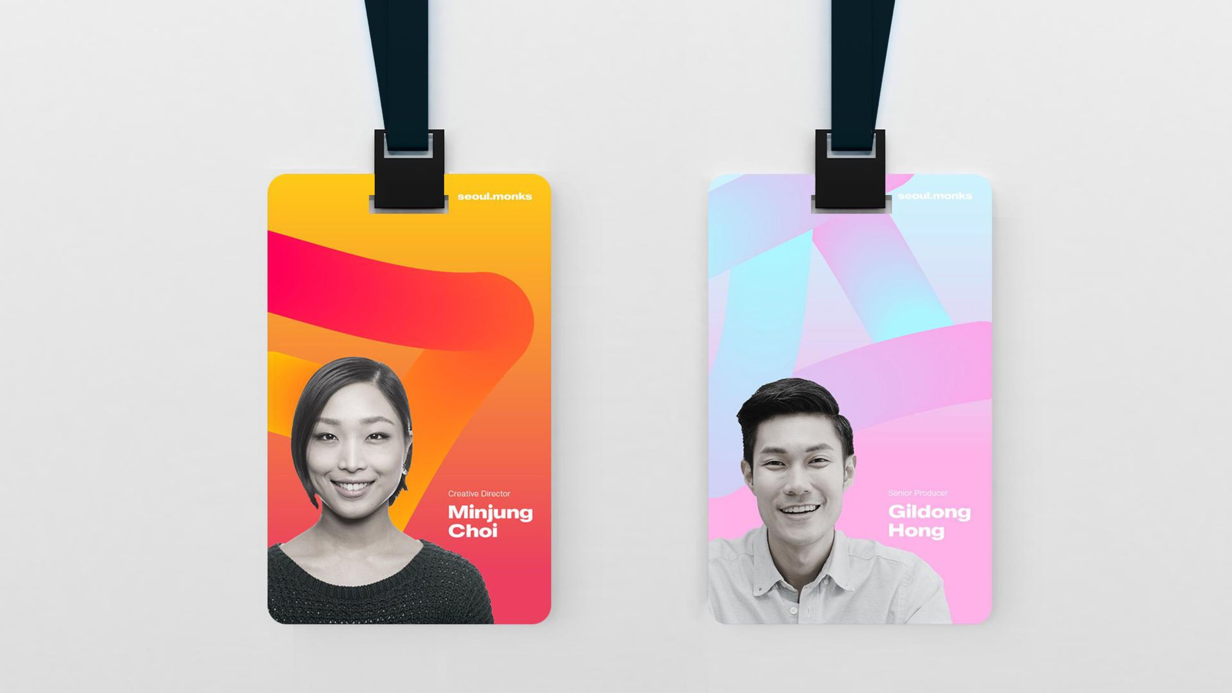
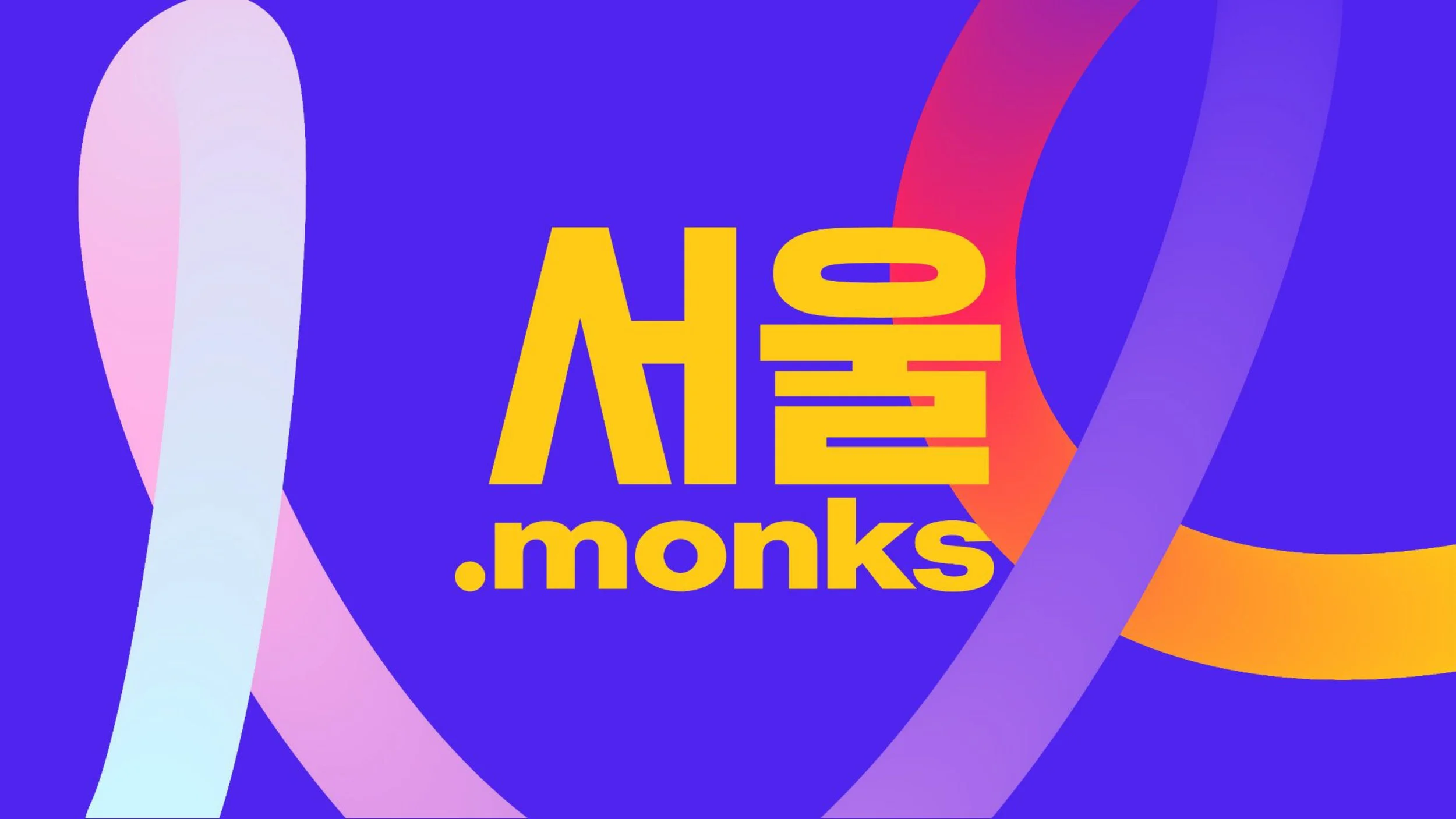
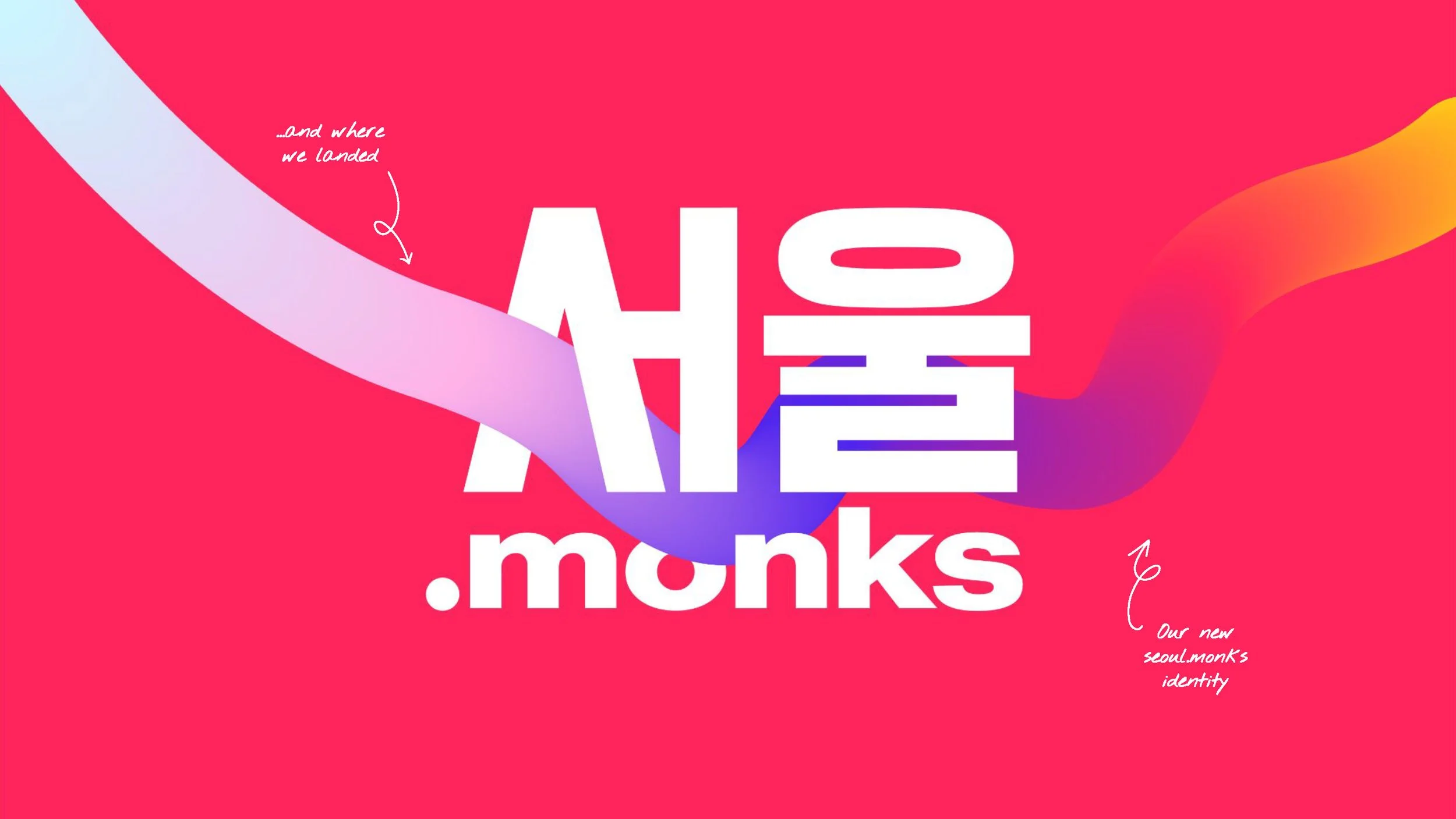
Seoul.Monks
We, as the new miracle of the Han River adpats the ideology of coexistence of tradition and modernity into the way we think, design and compose ourselves.
To bring that ideology to life in our visual identity, we took the Korean traditional colour spectrum (Obangsek 오방색) and transcended it to represent how we think; through data-driven creativity.
The stream of colours represent the agility, fluidity, and sustainability of seoul.monks as we change and adapt to the moving world around us.
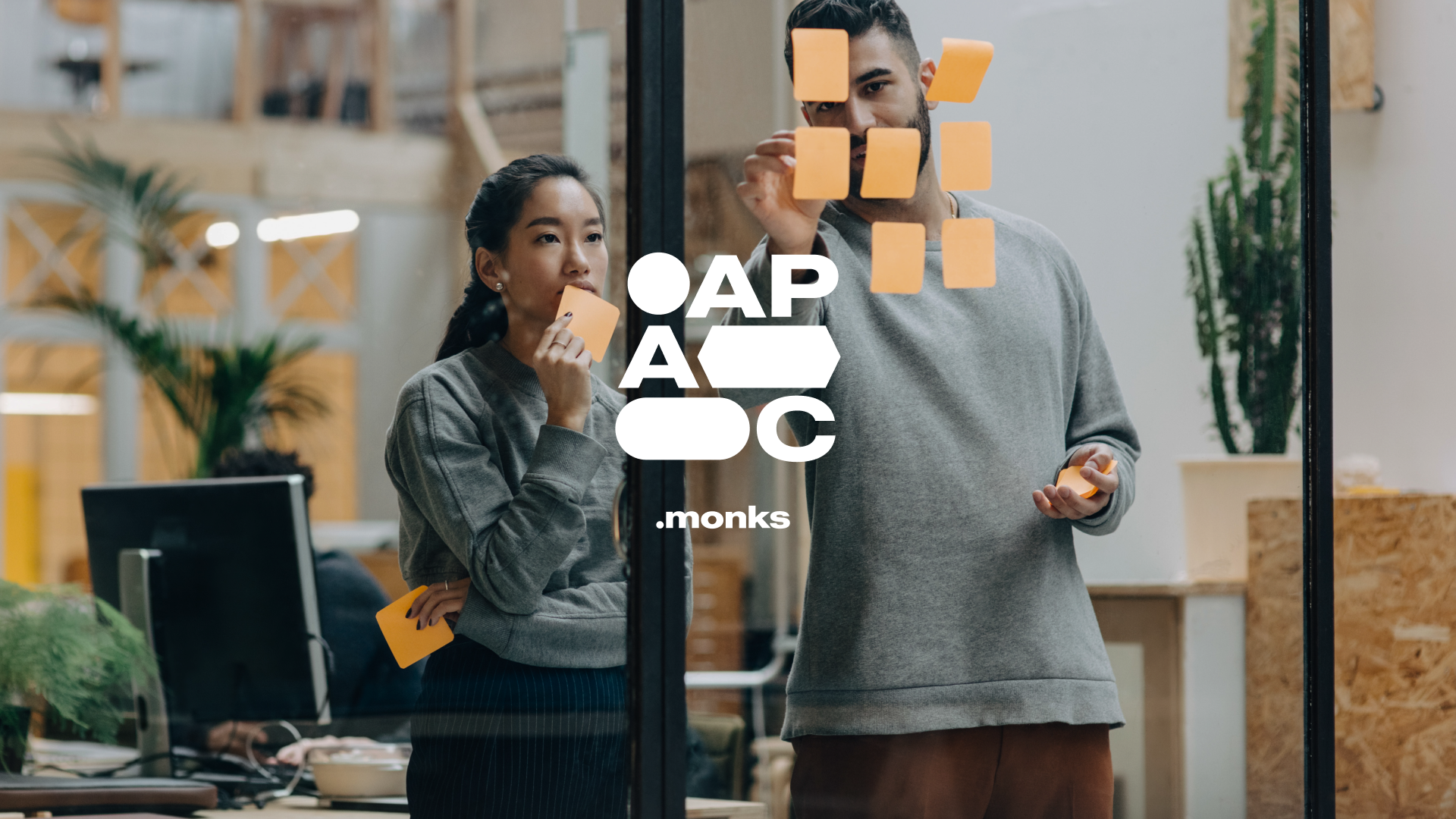
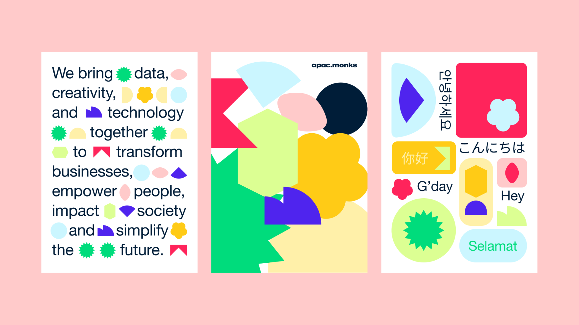
APAC.Monks
We are built on a culture of integration. Bridging creativity data and technology to transform businesses, impact society and simplify future.
Client Media.Monks
Year 2022
Role Art Direction, Branding Design, Graphic Design


To bring that ideology to life in our visual identity, we took the Korean traditional colour spectrum (Obangsek 오방색) and transcended it to represent how we think; through data-driven creativity.
The stream of colours represent the agility, fluidity, and sustainability of seoul.monks as we change and adapt to the moving world around us.